When setting out to design your own kitchen, selecting a colour palette based off current paint colour trends for your kitchen can subject you to a surprising amount of pressure. It can be intimidating and anxiety-inducing to consider the beauty of your brand-new custom design kitchen tainted by poor choice of colour. You can cover an unsightly colour up with a fresh lick of paint in a more tasteful tone – however this doesn’t circumvent the original issue of struggling to put a colour scheme together for your kitchen and gives you nothing but stress and wasted time. So, if you are reading this article about paint colour trends for 2020, buckle in and prepare for your journey into the important realm of colour scheme selection for your kitchen colour design.
Think About Your Future Needs And Wants In Paint Colour Trends
Some of the biggest mistakes we can make when selecting the colour schemes in our homes is to ignore our long term taste in favour of trying to keep up with fads or following the latest kitchen design craze. Perhaps the most important first step in selecting the colour palette for your new and improved kitchen is to consider what elements you need to keep in mind while choosing your modern kitchen colours.
Select colours that reflect and complement:
- The existing colour scheme or general tone of the whole home (if any) – There are many ways to keep in the theme of your whole home’s decor while still maintaining some individuality in the kitchen’s design. If you tend to prefer cool toned colours throughout your home, perhaps see if you can select similar colours, but with a warmer tone. The kitchen is the centre of activity in the family home, and settling on a warmer and more welcoming tone than the rest of the home is a clever way of both individualising the space and still retaining its place within the greater scheme of things in your household.
- The colours of your appliances, fixtures and other facets of the kitchen that will remain unchanged – Appliances and fixtures, unlike a simple coat of paint, are much more costly and difficult to replace when you feel it’s time to update your kitchen’s colour scheme. So ensure that when you are on the prowl for a new tin of paint it does not clash with the parts of your kitchen that are here to stay.
- The kinds of colours and atmosphere that you enjoy – it’s really important that when you are choosing your colours, you don’t just go with the new colour you saw your neighbour Karen said was “all the rage” and got for her kitchen. Unless, of course, this is a colour you can see yourself loving into the next few years. Ensuring you select a colour you like, have liked and know you will continue to enjoy well into the future can prevent you from waking up 6 months down the track, pondering what possessed you to settle on that questionable mustard yellow feature wall.
Now For The Main Event…
With these factors in mind, it’s time to move on to our favourite part – checking out what colour schemes are all the rage AND that fit our criteria for excellence in kitchen design. See? You can still follow the latest craze or trend when it comes to kitchen design – just make sure you’re savvy and pick the trend or colour scheme that fits in well with your needs.
Neutral Colour Schemes
Neutral colours are most definitely the safest route to take when planning your future kitchen design. With the ability to blend seamlessly into any home, you can’t go wrong with a well put-together collection of neutral tones.
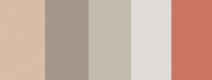
- Feng Shui – This neutral, calm palette features an ever so slightly earthy combination of neutral, nude-esque tones. This combination features a putty colour (Pancake Mix), a stony brown (Time Capsule), pale olive (Waitangi), pale grey (Ghost Town Quarter) and a terracotta pinkish-coral (Gold Pheasant). These tones would be well suited to a largely earthy, natural and generally calm home featuring wooden, clay or other natural, raw elements. This mix of both neutral and yet warm tones is a timeless combination that provides a muted elegance which you will love for years to come.
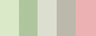
- Zesty Greens – Although this colour scheme may not be totally neutral, the featuring of many tones and shades of greens among a balance of neutral tones in this collection of colours is not to be missed. Green has been a popular colour for interior decoration since the Victorian era and will continue to stay in our hearts for good reason – green is the colour of life, bringing revitalising energy, peace, calm and positivity everywhere it is seen. For this colour scheme, feature a light green (Greenette), a slightly darker green (Sheer Green), a slightly green tinted putty (Green Frost Half), a darker putty (Putty) and a complementary pink (Pretty Pink). This lively combination of calming, revitalising and still relatively neutral colours is well complemented with a pink pop of colour in this scheme that stands out and adds a hint of individualism.
A Little More Pizazz
If you’re searching for the perfect colour scheme that boasts a more bright and lively colour selection, there are many options available that won’t send your kitchen back to the 80s. The trick here is knowing how to implement them in a way that highlights their vibrant nature without overwhelming the space.
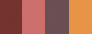
- Spice Trail – If you’re feeling confident with your kitchen and wanting to bring it that spice of life it deserves as the centre of your family home, some exciting bold colours are in order. Think about implementing a rich terracotta-toned brick (Brick Red), sunbaked pink (Bombay Pink), plum (Flamboyant Plum) and gold (Trinket Gold) collection into your kitchen. Although some of these colours come across as rather strong, their correct use can provide you with a lively, almost Mediterranean flavour in your home.
ONE COLOUR, ABOVE ALL OTHERS
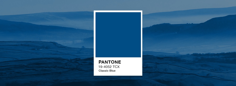
The Colour of the Year is an annual highlight for designers worldwide. Selectors look at influences throughout the arts, lifestyle, design and travel trends on a global scale, in order to find the top colour for in yearly trend forecast. Serving as a certainty for success, this strong influence on kitchen designers is sure to be an excellent choice.
PANTONE 19-4052 Classic Blue – This consistent, confident blue hue is solid and dependable. It provides an anchoring foundation to your kitchen, serving as an excellent base to derive a neutral, reassuring, and timelesss colour scheme. This elegant colour is sure to be a universal favourite, evoking the evening sky and calm introspection. Bring an honest, re-assuring, stable hue into your newly designed kitchen, with PANTONE 19-4052 Classic Blue
Bet on the right team when selecting your kitchen design specialists. Deciding on which paint colour trends to follow can be tough, so trust Elite to help you make all the right choices. Elite Kitchens and Cabinets are trained professionals with your best interests at heart, working with you to help you achieve your kitchen design hopes and dreams! Book your kitchen design consultation now.
